There are a LOT of planner layout options. What do you pick? Monthly? Weekly? Daily? Hourly? Horizontal? Vertical? Which one is best?
This question very quickly gets personal. Everyone has a planner layout that will work best for them. It really will depend most upon your own needs in a planner.
But stick with me, I’m going to go over some common planner layouts.
As a note, I will be using planner layouts from Plum Paper to discuss the various layouts. Plum Paper has the most options for planner layouts that I have found and all are customizable. If you would like to receive and email with a 10% Plum Paper discount link on a purchase of $30 or more, please scroll to the bottom of this post to enter your email address.
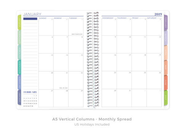
First up is the monthly layout. This layout is typically included in all the other layouts but can also be just by itself. This layout is great for people who don’t need full weekly or daily layouts and only have one or two things to record for each day.
Personally, I use this layout within my weekly planner to record important dates I need to remember like birthdays, anniversaries, special feast days, and important appointments.
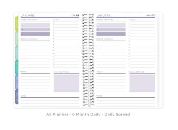
Next is the daily layout. (Yes, I know I skipped weekly but I’ll be coming back to that as there are many different weekly layouts available.) This layout is useful for people that have more to record each day than can fit in one of the weekly layouts below.
Personally, I find that this layout does not work for me. I end up leaving most of the pages blank which is not the point of this planner layout.
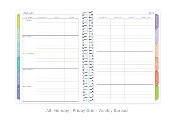
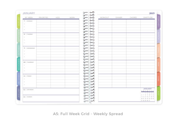
Now we are into the weekly spreads. These first two are horizontal grid layouts. I’m grouping them together as they are roughly the same layout except the lower one add some space for Saturday and Sunday. These layouts would work well if you need seven categories for Monday through Friday and much less space on the weekends.
Personally, these layouts would not work well for me as I like to have the same amount of space for my weekends.
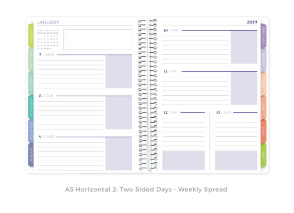
This is the typical horizontal layout. This layout is great if you intend to write in longer phrases or short sentences. It does not work well if you need more than eight lines as that is all that is provided here.
Personally, this was the first planner layout I chose when picking a planner. The vertical layouts were very new to me and I felt more comfortable with this layout. A horizontal layout similar to this is what my high school used for their student planners and so I was already familiar with it. However, this is not the layout I have stayed with long term.
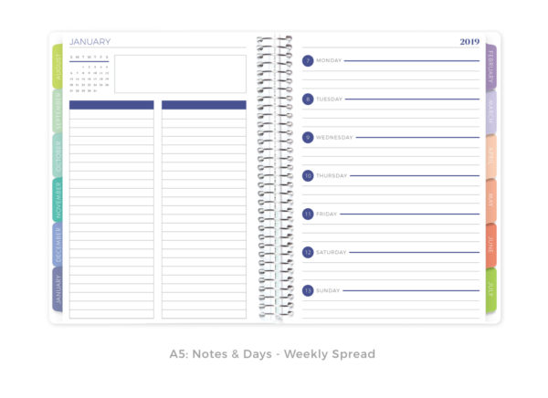
This is another common horizontal layout where you have a notes page and then a page with just a few lines for each day of the week. This layout works well for those who like to use their planner with a weekly checklist, grocery list, or with anything that needs a full page of notes each week.
Personally, this layout has not worked well for me as I find I fill up the daily sections too quickly. However, if you don’t have much each day, this layout might work well for you.

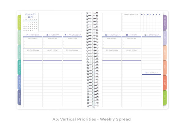
Then there is a form of the horizontal and vertical layouts that has sections for priorities and the most important to do of the day for the weekdays. In this layout, there is a small habit tracker at the top and both Saturday and Sunday have smaller sections. This layout works well for those who tend to focus each day on one priority or important to do.
Personally, this layout has not worked well for me. While I do appreciate the weekly habit tracker, trying to limit myself to one or two priorities and one or two important to dos has not worked out for me.
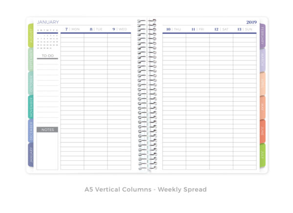
Now we are to the simple vertical layout. Each day of the week is listed across the top of the planner with a full column of lines for each day. This layout works especially well if you list items or events very briefly or use the daily sections as daily to do lists.
Personally, this layout works better for me than the horizontal layouts. I tend to list appointments briefly (i.e. 10am dentist) and to do items (i.e. vacuum) in daily columns. If that is the way you use a planner, this might work well for you.
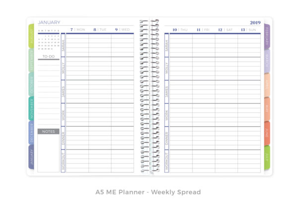
This is a vertical layout very similar to the simple vertical layout. Here each column is divided into six sections. These sections are able to be personalized and are a way to help keep your planner organized.
Personally, this is the layout that I have found works best for me. Each of the sections is able to be a different area of my life. For example, one section is for my blog, one section for my YouTube channel, one section for Catholic feast days/memorials, etc. I really enjoy this layout a lot.

Then there is the hourly layout. This layout is great if you are scheduling appointments every day or like to use a time blocking system. At a glance you can see when your daily appointments are and how you have used your time.
Personally, this layout has never worked well for me. I don’t use a time blocking system and I don’t have to schedule appointments. This just isn’t a practical layout for me.
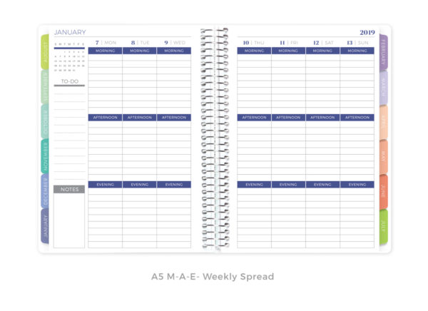
This is the last of the main vertical layouts known as the Morning-Afternoon-Evening layout. As you can guess from the name, the vertical columns are divided into three sections for morning, afternoon, and evening. This is a common vertical layout that you can find with most planner brands. It is great if you need the same space for each of the three parts of the day and that fits your daily life.
Personally, this layout works for me but is not my favorite. I tend to have more things in the afternoon and evening with less things in the morning and so the equal blocks don’t work well for me. I also like to be able to add things that don’t fit neatly into any of these areas.
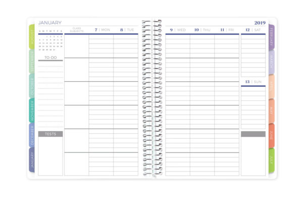
Many planner companies also offer a teacher planner. These typically have vertical or horizontal layouts. Here you can see a vertical layout. There is a column to enter class information such as name of the class and time with each section having room to enter information about the lesson that day.
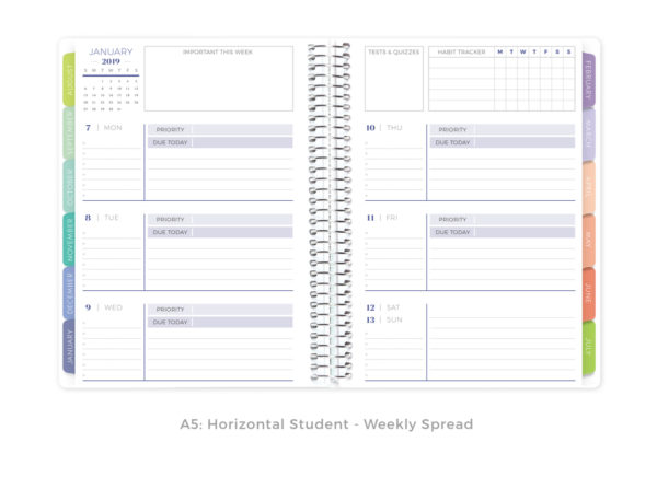

Then there are the student planners. These are also come in both horizontal and vertical layouts. They typically have a section for the day’s top priorities and what is due that day.
Personally, my problem with both teacher and student planners is that, unless you are a teacher or student, they need not to work well for me as the weekend blocks are too small.
There you have it. A brief overview of the most common planner layouts. Now it’s your turn to let me know:


I have used the Plum Paper Teacher Planner (great for teaching with multiple preps) and used the ME layout last year– I think it’s the one I will select again for this year! It seems to be the best strategy that works for a personal daily planner.
Thank you. Very Helpful.
Thanks!